 MegaMegaTypeType
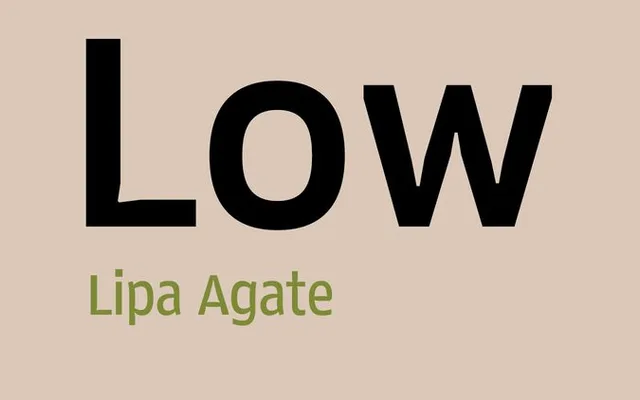
The squarer of Lipa Agate's two heights: a small-text sans by Ermin Međedović with ascenders held at cap height.
About
Lipa Agate Low keeps its ascenders at cap height, which gives blocks of tiny text a wider, squarer look than its High sibling at the same width. Ink is cut away at the joins so type at 5 to 10 points stays clear in liner notes, sports scores, tables and credits. Regular, Narrow and Condensed widths come in four weights, with small caps, info figures, arrows and dingbats.
Classification
The low version of Lipa Agate: a space-saving sans for microtypography whose ascenders stop at cap height, with ink traps at the joins for settings of 5 to 10 points.
Weights
LightRegularMediumBold
Optical sizes and widths
RegularNarrowCondensed
Languages
Latin
Tags
microtypographycondensednarrowspace-savinglegibilitysmalltextgrotesquefunctional