 MegaMegaTypeType
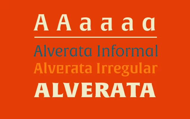
Gerard Unger's serif family rooted in his doctoral research on Romanesque inscriptions, in three structurally distinct subfamilies.
About
Based on Gerard Unger's PhD research into 11th and 12th century Romanesque lettering, Alverata takes its short, thorn-like serifs and flared forms from capital inscriptions. The Regular is a steady text face in six weights with italics, the Informal softens it with calligraphic details, and the Irregular swaps the curves and straight lines between upper and lowercase. A large x-height and open counters keep it legible at small sizes, and Greek and Cyrillic were drawn with Gerry Leonidas, Irene Vlachou and Tom Grace.
Classification
Alverata draws directly from Romanesque capital inscriptions of 11th and 12th century Europe, producing short thorn-like serifs and flared forms that place it outside conventional classical or transitional serif categories. The Irregular subfamily's exchange of curves and straight lines between upper and lowercase is an unusual structural experiment within the serif genre.