 MegaMegaTypeType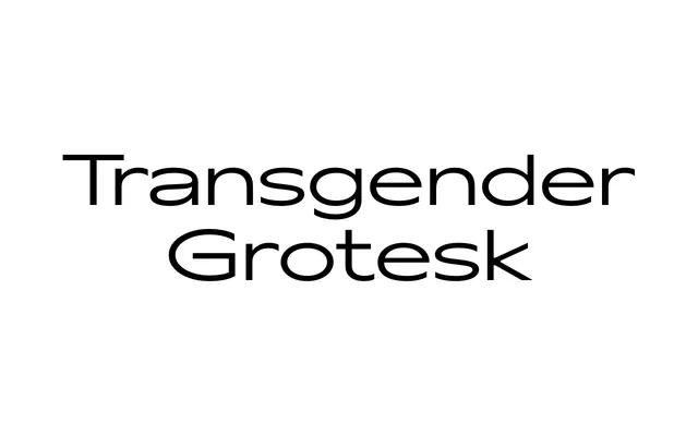
A single-weight wide grotesque with no stroke contrast, designed by Alexander Cherepanov for headings and short paragraphs at medium to large sizes.
About
Released in 2019, this extended Latin and Cyrillic grotesque carries a deliberately crude, slightly sharp character that sets it apart from more refined sans-serif releases. With case-sensitive forms, standard ligatures, a slashed zero and three stylistic sets, it offers enough variety for considered typographic work despite its single weight. Its wide proportions and monolinear construction suit editorial headings and branding at display sizes.
Classification
A monolinear wide grotesque with no visible stroke contrast, designed for half-display use at medium and large sizes. Its crude, sharp character places it firmly in the grotesque tradition rather than geometric or humanist sans.