 MegaMegaTypeType
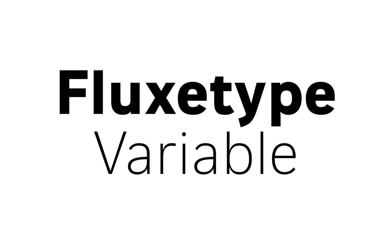
A variable face by Nikita Kanarev that sits between a humanist sans and a serifless roman, with axes for weight, optical size and x-height.
About
Fluxetype, as type.today spells it, began with paper letters cut into pieces and reassembled, which is how Kanarev worked out its idea of shifting, interlocking parts. Form and counterform fit together like a dovetail joint in woodwork. The variable font runs from Thin to Black, through Caption, Text, Title and Display sizes in Petite, Standard and Grande x-heights. It covers Latin and Cyrillic.
Classification
A humanist sans with subtle stroke modulation and flared, slightly angled terminals, short ascenders and descenders and open apertures. Counters cut into stems where curves meet straights.
Weights
ThinLightBookRegularMediumBoldBlack
Languages
LatinCyrillic
Tags
variablesans-seriftype-todaycontemporary