Yolker
Type Du Nord · Sophia Tai (Yolker Color) · 2021
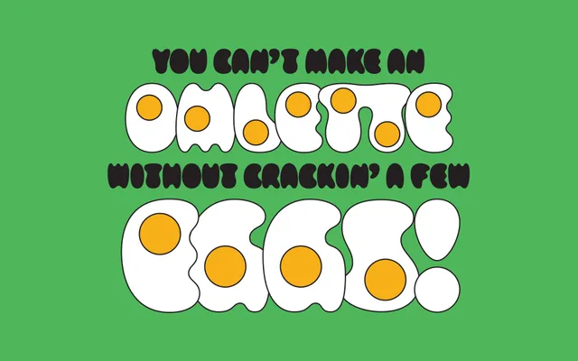
An egg-themed novelty display face originating from a 52-fonts project, where every letterform is shaped to approximate the volume of a fried egg.
About
Each glyph in Yolker abandons straight lines, sharp corners and conventional counters in favour of soft, rounded blobs intended to evoke eggs dropped into a pan. The family ships in five stylistic variants — Yolks, Yolks Outline, Yolkless, Yolkless Outline and a colour version designed by Sophia Tai — covering a spectrum from fully yolk-filled to outline-only forms. Despite its extreme concept, the foundry notes it remains surprisingly legible even at smaller sizes.
Classification
A purely novelty display face built entirely from rounded, egg-shaped forms, deliberately avoiding straight lines and sharp corners. Its organic, blob-like letterforms resist any conventional classification beyond decorative display use.