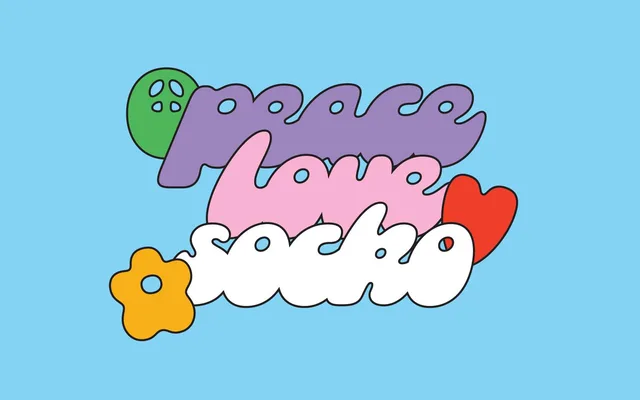
A two-style chunky display sans rooted in 1950s knitting-magazine lettering, built for posters, beverage branding and casual print use.
About
Originating from a hand-lettered 'SOCKO!' sketch in a 1950s knitting pattern, this typeface was developed through a 52-font design project before being fully realised as a Regular and Italic pair. Its fat, rounded forms carry a mid-century warmth suited to festival graphics, label design and informal merchandise. The glyph set includes extended Latin coverage and a generous run of standard ligatures.
Classification
A chunky, fat display sans with rounded, heavy forms derived from mid-century hand lettering. Its exaggerated weight and retro character place it firmly in the display category rather than a functional grotesque or geometric tradition.