 MegaMegaTypeType
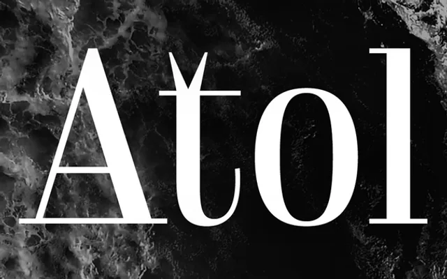
A contemporary Didone for tight, high-contrast headlines, with a playful set of ligatures.
About
Robert Jarzec's Atol takes the classic Didone and sharpens it for headlines: high contrast, compact modern proportions and small oddities that give it a voice, such as the forked top of the t. Six weights from Light to Black come with a variable font, stylistic alternates and a long run of discretionary ligatures. It suits magazine covers, branding and animated type.
Classification
A display Didone: hairline thin strokes and vertical stress, set in tight modern proportions. Distinguished by its quirky details, such as a t whose stem splits at the top, and a long set of discretionary ligatures.
Weights
LightRegularMediumBoldXBoldBlack
Family
Atol Variable
Languages
Latin
Tags
didonehigh-contrastdisplayeditorialfashionheadlinesligaturesvariable