 MegaMegaTypeType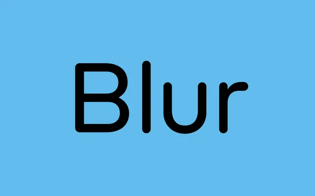
A modular geometric sans from ToSupply, first released in 2016, built from primitive shapes with rounded terminals and wide proportions across just two weights.
About
Constructed from simple geometric forms, the design softens its angular structure with rounded stroke endings that echo the visual quality of blurred edges. A large x-height and wide proportions support legibility at small sizes, while the two weights – Light and Regular – cover both body text and display use. Alternate glyphs for the 'a', 't' and 'r' are available via stylistic sets, offering modest typographic flexibility.
Classification
Built from primitive geometric shapes with rounded terminals, ToBlur sits firmly in the geometric sans tradition. Its wide proportions, large x-height and minimal stroke contrast align it with modernist geometric sans-serifs, while the rounded stroke endings give it a softer character.