Pigeonette
Tortilla.studio · Ro Hernández
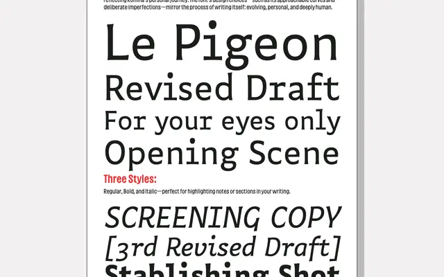
A semi-monospaced typeface born from a Type and Media graduation project, balancing typewriter rhythm with hand-crafted warmth for long-form writing use.
About
Developed by Ro Hernández at the Type and Media master's programme in The Hague, Pigeonette draws on the open spacing and slightly awkward proportions of typewriters while retaining a looseness reminiscent of hand lettering and Mexico's Taller de Gráfica Popular. Three styles – Regular, Bold and Italic – cover Central European Latin, with a Cyrillic version in development. A built-in squiggle placeholder, triggered by typing three or more underscores, is a small but considered feature aimed squarely at writers marking passages for revision.
Classification
Pigeonette is described as semi-monospaced and draws explicitly from typewriter spacing and rhythm, placing it firmly in the mono/typewriter category. Its hand-crafted character and deliberate imperfections give it a display-adjacent warmth, but the core design intent is monospaced reading texture.