Outpact
Tortilla.studio · Romina
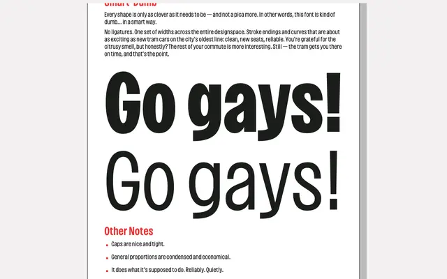
A condensed grotesque born from Mexican market signage and early-internet typography, blending Impact's punchy rhythm with soft, post-Arial curves across a duplexed designspace.
About
Designed by Romina at Tortilla.studio, Outpact maintains identical character widths across all weights — a duplexed approach that prevents layout reflow when switching weights on screen or in print. Tight vertical proportions suit multi-line headlines, while open counters keep it functional at text sizes. The design draws on Roger Excoffon's Antique Olive and the vernacular signage of Mexico City's street markets, channelling that world's cheerful distortion into something quietly considered.
Classification
A condensed grotesque with duplexed widths across the designspace, blending Impact's tight mechanical rhythm with the rounded, even strokes of post-Arial humanist sans-serifs. Proportions lean condensed and economical, with Antique Olive cited as a structural influence.