Supertuba
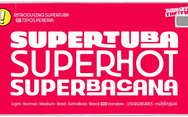
A geometric sans display family drawn from letterboard signage traditions, offering six weights, a variable font and an unusually large set of ligatures suited to posters, flyers and packaging.
About
Inspired by the removable-letter boards once common in Brazilian bars, churches and butcher shops, Supertuba sits in an unpretentious vernacular tradition while applying geometric construction. The family's dozens of ligatures make it well suited to short, punchy layouts, and the included variable font broadens its range. It forms the third part of a trilogy alongside Stubby and Stubby Rough, tracing a path from rough vernacular drawing to unusual geometry.
Classification
A geometric sans-serif display family with strong vernacular character, inspired by letterboard signage from churches, bars and butcher shops. Its geometric structure is offset by an unusually large ligature set and a bold, poster-ready personality.