serifunknown
This page outlines The MicroFoundry's approach to typeface quality rather than describing a specific font release.
About
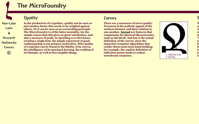
The MicroFoundry describes quality as an overarching principle rather than a variable to be traded off, citing over 800 hours spent on a single font. Their quality criteria span curve fidelity, optical compensation for ink bleed, spacing informed by English word-frequency data, kerning and bitmap hinting. No specific typeface is presented on this page.
Classification
The page describes The MicroFoundry's design philosophy and quality standards rather than a specific typeface. No typeface name, category or visual details are present on this page.
Languages
Latin
Tags
craftsmanshipspacingkerningqualitybitmapscurves