 MegaMegaTypeType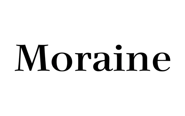
A high-contrast serif sketched in a weekend as a teaching exercise, reworked years later to trade its original fragility for a proper weight range.
About
Montalbano first drew Moraine over a weekend, by his own account to embarrass a class of underperforming students into working harder. It sat unused for years until 2009, when he strengthened its excessive contrast and fragile strokes into a proper eight-weight family. Wide cupped serifs and tapered stems avoid straight lines throughout, and the italics were hand-corrected rather than simply slanted, in a style Montalbano calls potentially post-modern.
Classification
Originally sketched in a weekend as a teaching tool, then reworked in 2009 to fix excessive contrast and fragility. Wide cupped serifs and tapered stems with no straight lines, in a style the designer calls potentially post-modern rather than tied to one historical model.