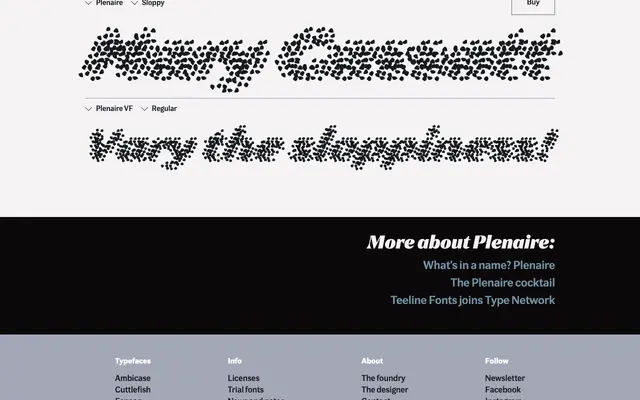
An experimental italic display family inspired by Impressionist painting, whose letterforms are constructed from fragmented daubs that resolve into legibility only when viewed at a distance.
About
Plenaire offers three static styles – Neat, Regular and Sloppy – ranging from relatively solid letterforms to near-illegible scatter, plus a variable font that lets the designer control the degree of fragmentation along a single axis. The concept draws directly from the visual language of Monet and Seurat, where broken marks coalesce into coherent images only at a remove. It is a rare typeface where optical distance is a functional design requirement.
Classification
An experimental italic display face built around optical illusion, where fragmented 'daub' letterforms coalesce into legibility at a distance. Its variable axis controlling scatter places it firmly in the display/experimental category rather than any conventional style.