 MegaMegaTypeType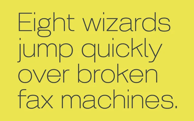
A five-weight humanist grotesque with old-style double-storey forms, loosely inspired by a 1927 Piet Zwart design, with bespoke italic characters for a more flowing rhythm.
About
Korbin draws on early 20th-century grotesque letterforms, particularly a sheared terminal on the upper leg of the K and a spur on the lower-case a, while evening out the idiosyncratic irregularities typical of hand-drawn originals from that era. The family spans five weights from Light to Black, with italic variants featuring additional bespoke characters to improve flow. It occupies the territory between humanist warmth and geometric discipline, suited to both text and display settings.
Classification
A sans-serif blending humanist and geometric traits, with old-style double-storey a and g, sheared terminals, and early 20th-century grotesque references. The designer explicitly describes it as a classic sans with humanist-geometric balance.