 MegaMegaTypeType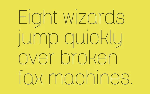
A narrow geometric sans-serif inspired by DIN, built around a lozenge-shaped 'o' with single-storey 'a' and 'g', spanning seven weights from Thin to Ultra.
About
Klamp 105 takes DIN as its starting point but refines the concept around a lozenge-shaped 'o' that sets the proportional logic for the entire family. Designed to work as a text font as much as a display face, it includes practical legibility decisions such as a flicked lowercase 'l' to avoid confusion with 'I' or '1'. The narrow proportions keep it economical on the page, while simplified descenders on 'g' and 'y' contribute to the overall clean character.
Classification
A geometric sans-serif with DIN as its primary reference point, built around a lozenge-shaped 'o' and featuring single-storey 'a' and 'g'. Its narrow proportions and simplified forms place it firmly in the geometric/rational sans tradition.