Wolpe Tempest
Tabular Type Foundry · Berthold Wolpe (original), Toshi Omagari (revival) · 2017
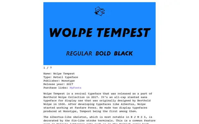
A revival of Berthold Wolpe's 1936 all-capitals slanted display sans, expanded from the single original weight into three, with Greek, Cyrillic and extended swash alternates.
About
Originally produced at Monotype in 1936, Tempest shares the incised, Albertus-like skeleton most visible in characters such as B, J, M, 3 and 5, decorated throughout with fin-like stroke terminals characteristic of Wolpe's lettering work. The revival adds two lighter weights to the original dark cut and substantially extends the set of swash letters present in the source material. Greek and Cyrillic script support broadens its reach beyond the Latin original.
Classification
An all-capitals slanted display sans with distinctive fin-like stroke terminals and an Albertus-influenced skeleton. Designed for large-scale use, its incised terminals and oblique stress place it firmly in the display category rather than a functional text sans.