Wolpe Pegasus
Tabular Type Foundry · Berthold Wolpe (original), Toshi Omagari (revival) · 2017
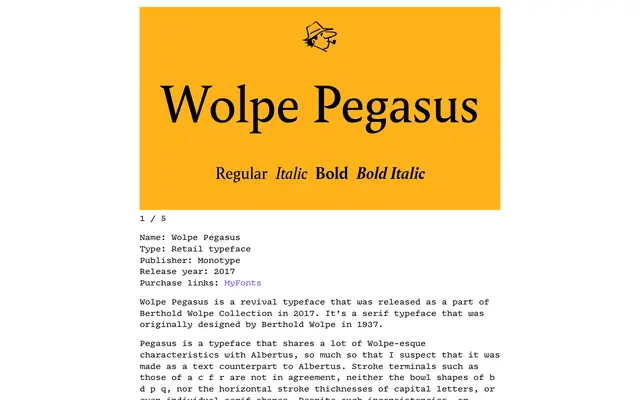
A careful revival of Berthold Wolpe's 1937 Pegasus, long considered a lost gem, with corrected italics, small caps and updated spacing by Toshi Omagari.
About
Originally sketched by Wolpe at actual size in pencil and produced in only one size and weight at its 1937 release, Pegasus was digitised with Bold and Italic by Matthew Carter in 1980 but never publicly released. Omagari worked from archive drawings at Monotype and The Type Archive, updating diacritics, punctuation and spacing to modern standards while correcting the mechanically slanted italic that had distorted the original. The typeface's intentional inconsistencies in terminals, bowls and serif shapes are retained, functioning as a lesson in how horizontal rhythm can carry a text face where strict geometric regularity cannot.
Classification
A mid-century humanist serif with idiosyncratic stroke terminals, irregular bowl shapes and intentional design inconsistencies rooted in Wolpe's pencil-sketched originals. Its vertical rhythm and spacing give it strong text readability despite its unconventional detailing.