Tokyo Dome City
Tabular Type Foundry · Toshi Omagari · 2023
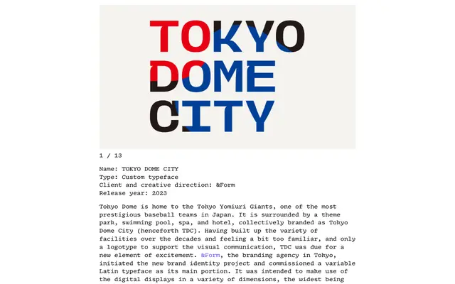
A capitals-only variable display sans commissioned by Tokyo Dome City and branding agency &Form, built across 180 masters spanning weight, width, height and slant axes for use on digital displays up to 120 metres wide.
About
Designed for Tokyo Dome City's new brand identity, the typeface uses monospaced metrics and a restricted uppercase character set to keep an extreme variable design space manageable. Four variable axes – weight, width, height and slant – combine across 180 masters, enabling animation and display across screens of wildly differing proportions. Ink traps, curved diagonals and occasional low waists give it a casual, entertainment-focused character distinct from conventional corporate display lettering.
Classification
A capitals-only, monospaced-metrics variable display sans with ink traps and curved diagonals, designed for large-scale digital displays. Its casual, punchy character and extreme parametric range place it firmly in the display category.