Platia
Tabular Type Foundry · Toshi Omagari · 2021
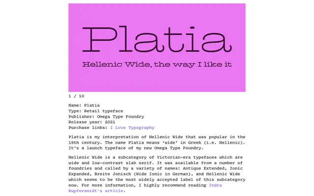
A scholarly interpretation of the 19th-century Hellenic Wide slab tradition, resolving the historical tensions between uppercase and lowercase through contextual alternates and near-monolinear stroke contrast.
About
Platia draws on the Antique Extended / Hellenic Wide genre of Victorian display slabs, harmonising the disparate uppercase and lowercase into a coherent monolinear whole. Contextual alternates with shortened serifs reduce excessive spacing when wide capitals meet, making the typeface more practical than its historical predecessors. Coverage extends to Cyrillic with Bulgarian alternates and Greek, the latter a pointed nod to the typeface's etymological roots.
Classification
Wide, low-contrast slab serif in the Hellenic Wide tradition, a Victorian-era subcategory also known as Antique Extended or Ionic Expanded. The near-monolinear stroke contrast and extended proportions are characteristic of 19th-century display slabs.