Metro Nova
Tabular Type Foundry · Toshi Omagari · 2013
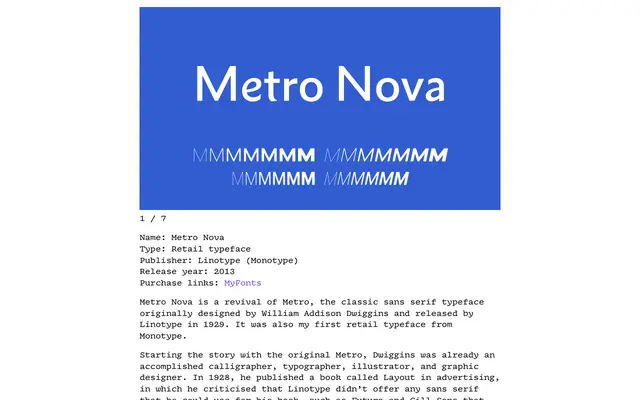
A scholarly revival of William Addison Dwiggins' 1929 Metro, restoring the lesser-known humanistic No. 1 design as the default while offering the familiar geometric No. 2 alternates via OpenType stylistic sets.
About
Dwiggins designed Metro for Linotype in 1929 as a humanistic sans with double-storey a and g and a cursive e, but the later geometric alternates became the standard offering, leaving the original virtually forgotten. Toshi Omagari's revival corrects the original's duplexing constraints so that letter widths now increase proportionally with weight, and adds small caps, oldstyle figures and a condensed subfamily. The humanistic No. 1 forms are restored as defaults, with ten granular OpenType stylistic sets allowing precise control over individual letterforms.
Classification
A revival of Dwiggins' Metro, which was originally a humanistic sans with double-storey a, g and cursive e. Metro Nova restores the No. 1 humanist defaults, distinguishing it clearly from the geometric Futura-influenced No. 2 alternates.