Albertus Nova
Tabular Type Foundry · Berthold Wolpe (original), Toshi Omagari (revival) · 2017
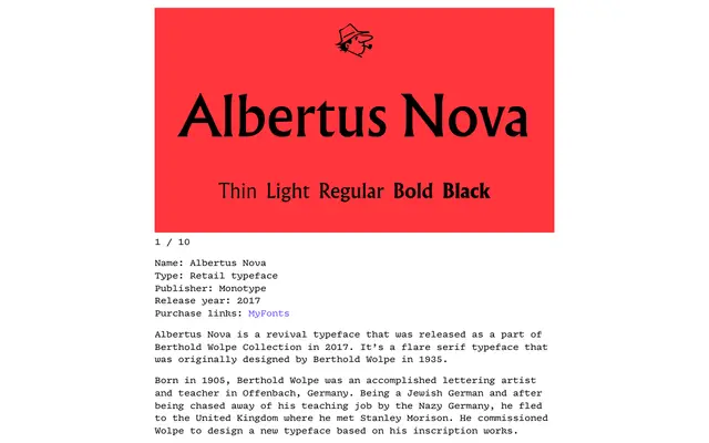
A thorough revival of Berthold Wolpe's 1935 flare serif, correcting weight and spacing discrepancies between the original uppercase and lowercase whilst restoring alternates and adding Greek, Cyrillic and new weights.
About
Wolpe's Albertus began as an all-cap display face commissioned by Stanley Morison and grew haphazardly over decades, leaving visible inconsistencies between its capital and lowercase designs. Toshi Omagari researched the original drawings at the Monotype Archive and The Type Archive to understand these quirks before rationalising proportions, restoring historical alternates, adding small caps and extending the character set to include Greek and Cyrillic. The result addresses the limitations of a typeface long beloved for book covers, street signage and screen credits despite its technical shortcomings.
Classification
A flare serif (also known as a hybrid between inscriptional roman capitals and humanist forms), Albertus Nova sits between a sans-serif and a traditional serif, with low stroke contrast and wedge-like flares rather than full bracketed serifs.