My Maps Sans Albers Equal Area Conic
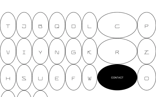
A geometric sans-serif from SUVA Type Foundry conceived around the Albers equal-area conic map projection as a formal starting point for letterform design.
About
Taking its name from a cartographic projection used in mapmaking, the typeface explores how spatial distortion and geometric constraint can inform the construction of letterforms. The page content offers little technical detail, suggesting a minimal or experimental release. SUVA Type Foundry's practice typically engages with conceptual frameworks drawn from outside typography.
Classification
The name references a cartographic projection, suggesting a geometric or technical sans-serif design. Classified as geometric sans based on the foundry's conceptual framing around map projections and spatial distortion.