Epica Pro
Sumotype · 2016
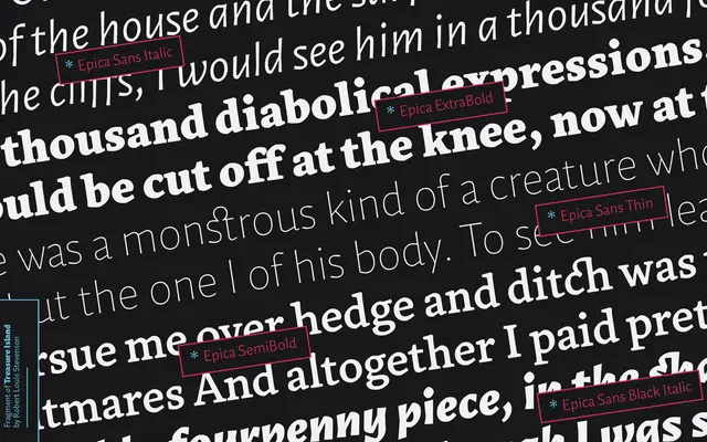
A humanist serif family rooted in Venetian Renaissance letterforms, offered alongside a complementary sans for typographic hierarchy and composition.
About
Epica Pro draws on humanist calligraphic traditions, balancing classical elegance with contemporary structure across five weights with matching italics. Its paired companion, Epica Sans Pro, extends the system with seven weights and matching italics for greater compositional range. The family was recognised at both the Bienal Iberoamericana de Diseño and Bienal Tipos Latinos in 2016, and supports an extensive range of Latin-based languages.
Classification
Rooted in Venetian Renaissance letterforms with calligraphic influences, Epica Pro is a humanist serif with a paired sans companion, placing it firmly in the humanist serif tradition with contemporary refinements for both text and display use.