 MegaMegaTypeType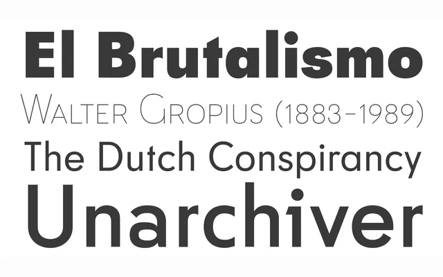
A flexible geometric sans in eight weights with three small caps sizes (Big, Small, Petite), working at both text and display sizes.
About
Tafel keeps the intrinsic qualities of a geometric sans without following its usual strict rules, its sophisticated elegance and refined simplicity suiting corporate identities, street signage, fashion brands and luxury packaging. Old-style figures and matching italics run through all eight weights.
Classification
A contemporary take on early to mid-century geometric sans conventions without strictly following their rules, distinguished by three small caps sets of different x-heights.
Weights
ThinLightRegularSemiBoldBoldExtra BoldBlack
Languages
LatinLatin ExtendedCentral EuropeanEastern European
Tags
sans-serifgeometriccorporateluxurylegible