 MegaMegaTypeType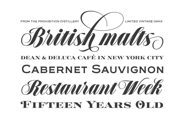
A five-font menu and liquor-label toolkit originally commissioned for the most famous speakeasy bar in Buenos Aires.
About
Speakeasy contains a connected script (with two ways to join letters), a minor wedge serif, a flare serif, a sans serif and a bold Didone, all with small caps. The script's seed came from a German lettering book, while the other fonts reflect early twentieth-century advertising conventions, together suited to menus, coffee branding and restaurant signage.
Classification
A five-font thematic toolkit (Script, Gothic, Modern, Flare, Sans) built for menus and liquor labels, originally commissioned for a Buenos Aires speakeasy bar.
Weights
ScriptGothicModernFlareSans
Languages
LatinLatin Extended
Tags
displaymenucocktailbrandingtoolkit