 MegaMegaTypeType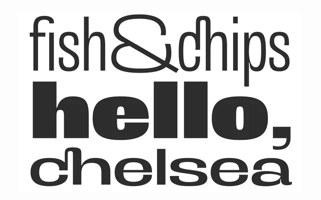
A grotesque display family pushed to extreme weights and widths, built for short reading at large sizes.
About
Antipoda takes its cue from the origins of late nineteenth-century sans serifs and pulls the letterforms toward opposite extremes: fat and thin, condensed and extended. Three weights, three widths and a variable font let it flex between quiet and maximum visual impact.
Classification
A grotesque built at extreme weights and widths, closer in spirit to late nineteenth-century sans origins than to a neutral contemporary grotesque.
Weights
LightRegularBlack
Optical sizes and widths
CondensedRegularExtended
Languages
LatinLatin Extended
Tags
grotesquedisplaypostereditorialvariable