 MegaMegaTypeType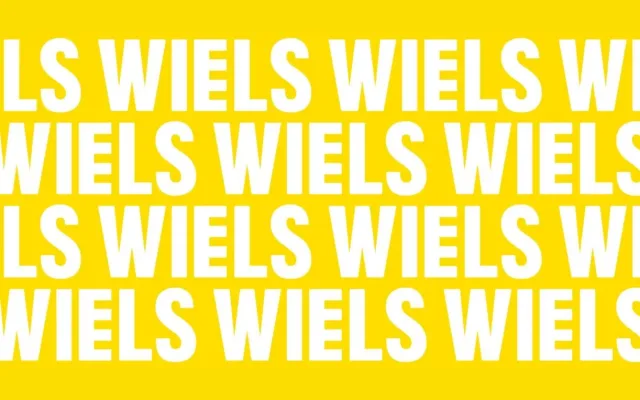
A geometric display sans in three weights, originally created for Brussels contemporary art centre WIELS, its letterforms drawn from the modernist industrial architecture of the 1930 Blomme Building.
About
Designed for WIELS, Centre of Contemporary Art in Brussels, the typeface was developed to serve headlines, posters, signage and the institution's website. Its character is shaped by the four-tiered structure of the Wielemans Brewery building, with the five-bar E taken directly from the WIELS logo. Further references to Marcel Broodthaers' typographic work feed into the family's broader visual language.
Classification
A display-oriented geometric sans serif with three weights, designed for signage and headlines. Its distinctive character draws from the modernist industrial architecture of the WIELS building, including the five-bar E borrowed from the institution's logo.