ST Toone
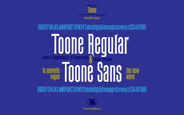
A condensed poster serif and matching sans, revived from a 19th-century Belgian wooden typeface in the collection of Fonderie Typographique A. Vanderborght & Dumont.
About
Developed as part of 'Typo Belgiëque', a research project into Belgium's typographic heritage, ST Toone reinterprets a slender elongated poster typeface from a Brussels foundry. The family comes in two variants: a spiky serif and a companion sans, both sharing the same condensed proportions. Suited to logo work, editorial layout, film credits and packaging, the design balances historical reference with a clean contemporary feel.
Classification
A tall, spiky, condensed serif with a companion sans-serif variant, inspired by a 19th-century Belgian wooden poster typeface. Its extreme vertical proportions and slender construction place it firmly in the display category.