ST Tenzin
Studio Type · Jo De Baerdemaeker · 2016
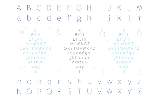
A thin humanist sans originally designed for the Flanders and Netherlands joint presentation at the 2016 Frankfurt Book Fair, drawing on historic Low Countries type collections.
About
Designed by Jo De Baerdemaeker, the letterforms are informed by typefaces from the Plantin-Moretus museum in Antwerp, Johannes Enschedé & Zonen in Haarlem and Lettergieterij Amsterdam. A generous ligature set encourages letters to flow into one another, reflecting the cultural and geographic fluidity between Flanders and the Netherlands. The full system encompasses six weights with italic and reverse italic styles, and is currently being extended with Tibetan script support.
Classification
A thin, light-weighted sans serif whose letterforms derive from analysis of historic Flemish and Dutch printing types, with typewriter-inspired details. The humanist structure reflects its roots in the Plantin-Moretus, Enschedé and Lettergieterij Amsterdam typographic traditions.