ST Lungta
Studio Type · 2009
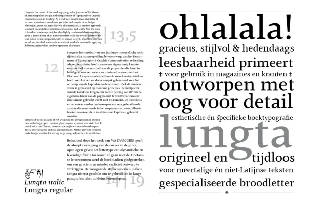
A bilingual Latin and Tibetan text face developed at the University of Reading, designed for scholarly book setting with sturdy counters and a Dwiggins-influenced curvature.
About
Developed through the MA programme at the Department of Typography and Graphic Communication at Reading University, ST Lungta pairs a refined Latin text face with a Tibetan script, attuning both to a shared visual colour on the page. The italic runs at a gentle 10° slope with slight condensing to sit comfortably alongside the roman in continuous text. It was adopted by Oxford University Press and used for the Tibetan portions of a University of Chicago Press publication in 2009.
Classification
A text serif with old-style characteristics in the lowercase but a modern treatment of capitals and serifs, influenced by W. A. Dwiggins. The abrupt counter curvature and sturdy construction place it in the transitional tradition, designed for extended text setting.