Tomato
Studio Linda Hintz · Linda Hintz · 2020
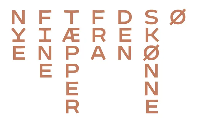
A wide geometric monospaced typeface drawn for Tomato Studio Store, supporting both vertical and horizontal typesetting across three weights with a later slanted variant.
About
Built around a near-circular O rather than the typical narrow mono unit, Tomato arrives at an unusually wide character proportion that suits both horizontal and vertical setting. The character set is compact and purpose-built for the client, demonstrating that bespoke typefaces are viable even for smaller companies. Three weights allow for hierarchy, while selective kerning pairs and variable-width punctuation soften the rigidity of the mono grid in longer horizontal text.
Classification
A monospaced typeface built around a near-circular O, resulting in an unusually wide design. Its fixed-width grid accommodates both horizontal and vertical typesetting, with some kerning pairs and half or double widths introduced as practical concessions.