 MegaMegaTypeType
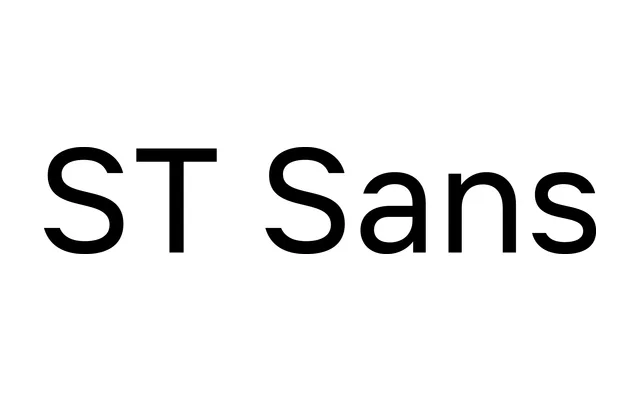
A moderately compact neo-grotesque from SteppeType that tempers the clinical neutrality of the genre with open spacing and soft optical compensations suited to extended reading.
About
ST Sans sits between strict neutrality and humanist warmth, with reduced uppercase proportions and modest spacing that keep it comfortable at small sizes without sacrificing clarity at display scale. Six weights from Thin to Black are available, along with a variable font included with the full family purchase. A Dprofile Recommended award in 2026 marks its recognition within the Russian design community.
Classification
A neo-grotesque sans-serif in the tradition of Helvetica and Univers, distinguished by reduced uppercase proportions, open spacing and soft optical compensations that push it toward a more humanist character than typical neutrals of the genre.