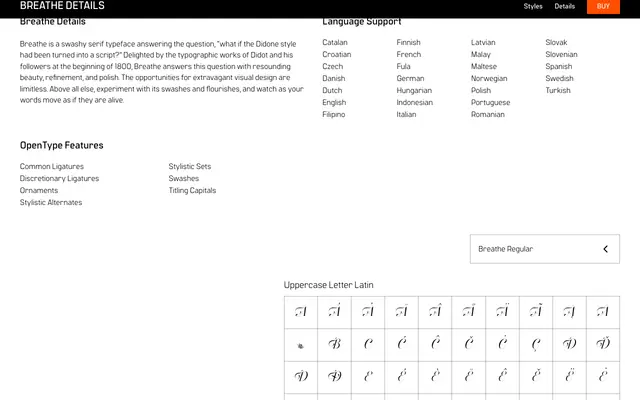
A single-weight display serif that imagines the Didone tradition reimagined with script-like swashes and extravagant flourishes.
About
Drawing on the high-contrast letterforms of Didot and his early 19th-century followers, it extends the style with swash capitals, discretionary ligatures, ornaments and contextual alternates that give text an animated, calligraphic quality. Titling capitals, final forms and multiple stylistic sets provide considerable compositional flexibility for decorative work. Latin character coverage spans over two dozen European languages.
Classification
A high-contrast serif conceived as a hybrid between Didone and script, with prominent swashes, flourishes and extensive alternate forms that push it firmly into display territory rather than conventional text serif.