 MegaMegaTypeType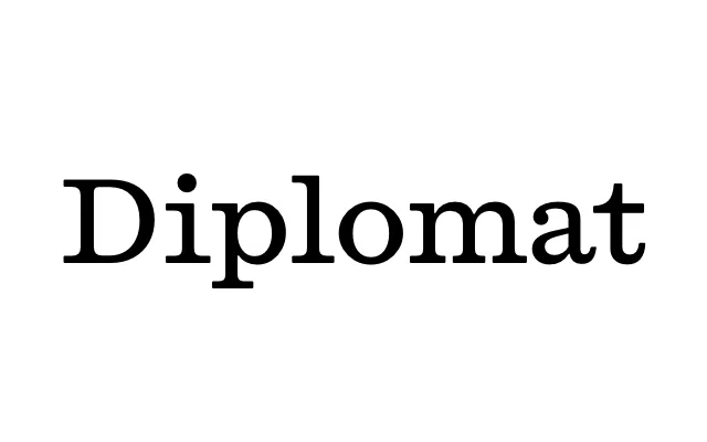
A proportional serif reverse-engineered from the typewriter face on the spine of the 1972 documenta 5 binder, in eight styles plus a monospace.
About
Developed by Laurenz Brunner after encountering the documenta 5 binder in the archives during work on documenta 14, the design translates the aura of a typewriter face into a fully proportional family with four weights and matching italics. Its character sits between formal roman and slab serif, making it legible enough for extended reading yet distinctive enough for editorial identity work. Widespread use as the house font of Fantastic Man demonstrated its range across layout contexts.
Classification
Sits between a roman and a slab serif. Reverse-engineered from a monospaced IBM Selectric typewriter face and expanded into a proportional family, which keeps its squarish, even-stroked build.