Automata
Sogari Design · Enrico Sogari
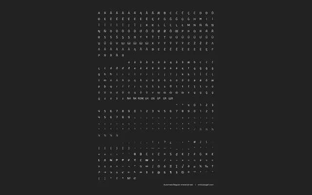
A geometric sans-serif in six weights with a retro-futuristic character, offering stylistic alternates, discretionary ligatures and broad Latin language support.
About
Automata is built on smooth, clean lines and circular geometric construction, aiming to read as technological without sacrificing legibility at medium and small sizes. Six weights from Extra Light to Black are supported by OpenType features including stylistic alternates, discretionary ligatures, tabular figures and fractions. Language coverage spans 29 Latin-script languages across Western and Central Europe.
Classification
A geometric sans-serif with clean, smooth lines and a retro-futuristic aesthetic. The design draws on circular geometric construction and technological references, placing it firmly in the geometric sans tradition.