 MegaMegaTypeType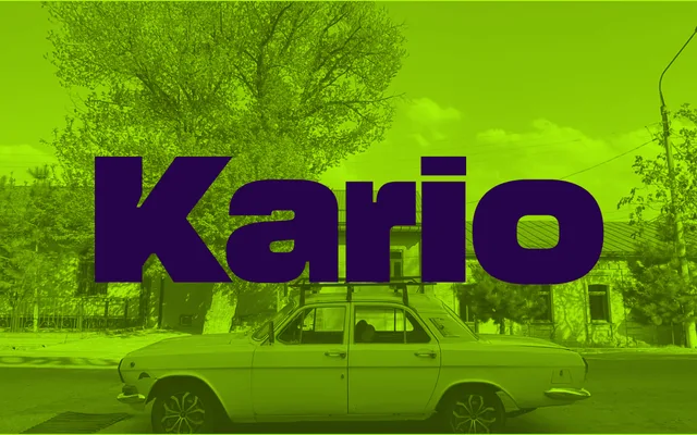
A variable duplex grotesque by Bernd Volmer spanning nine widths and seven weights, built on the German Reklameschrift tradition with an oversized x-height and tight spacing engineered for advertising use.
About
Kario operates as a uniwidth family, meaning character widths remain consistent across its seven weights — a technically demanding constraint that allows smooth interpolation without glyph substitution. The width axis stretches from XXXCondensed to XXtended, with a separate optical size sub-family, Kario S, offering wider spacing and longer extenders for small text. The complete family runs to 112 styles, available as variable fonts or individual static cuts.
Classification
A constructed grotesque sans-serif with an oversized x-height, tight spacing and short ascenders and descenders — characteristic of the German Reklameschrift (advertising type) tradition. The duplex/uniwidth variable architecture keeps character widths consistent across weights, enabling smooth interpolation across an extreme width range.