 MegaMegaTypeType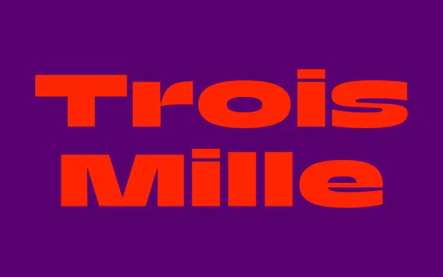
An expansive display sans-serif spanning seven weights across 21 widths in roman and italic, rooted in the French tradition of Roger Excoffon and five years in the making at Sharp Type from a TypeMedia thesis.
About
Trois Mille began as Marc Rouault's 2016 TypeMedia thesis and spent five years in development before Sharp Type released it as a full commercial family. Inspired initially by Roger Excoffon – the spirit of Antique Olive is clearly present – it evolved its own novel construction methodology and a strikingly ambitious design space: seven weights in 21 widths of roman and italic, from ultra-condensed to dramatically expanded. It is one of the most structurally ambitious display families in any current foundry catalogue.
Classification
Humanist display sans-serif inspired by Roger Excoffon, particularly Antique Olive. Originated as Marc Rouault's 2016 TypeMedia (KABK) thesis and developed over five years before commercial release. Features a novel construction methodology and an extraordinary 21-width range across seven weights in roman and italic, spanning ultra-condensed to ultra-expanded. The page confirms six weight names (Thin, Light, Regular, Medium, Bold, Black); the foundry states seven weights total. Width designations use a numerical system (13 through 183+).