 MegaMegaTypeType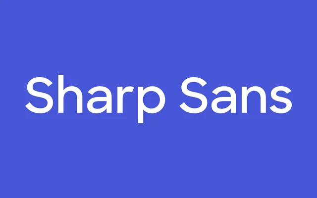
A clean, precise geometric sans-serif from Sharp Type, available in eight weights with italic and a companion Display subfamily suited to headline use.
About
Sharp Sans is Sharp Type's geometric sans-serif, built on circular geometry with a tall x-height and open apertures that keep it legible at text sizes while retaining the crisp character needed for branding and display work. Eight weights from Thin to Black, each with italic, give it a working range across hierarchy. Sharp Sans No. 2 offers a subtle proportional alternative within the same visual system, and a Display subfamily extends the family into large-scale editorial and identity use.
Classification
Geometric sans-serif with precise circular construction, tall x-height, and open apertures. Single-storey 'a' and 'g'. Closer to the Futura–Avenir tradition than a humanist or grotesque reading. Sold as distinct weight files. Sharp Sans No. 2 is a companion subfamily with subtle proportional differences. Display subfamily optimised for large-scale headline setting. Note: sharptype.co returned HTTP 429 during research; entry draws on training-data knowledge of the family.