 MegaMegaTypeType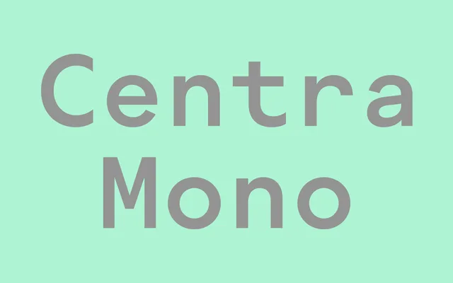
The fixed-pitch member of the Centra system, extending the family's geometric character into monospaced form for code editors, interfaces and data display.
About
Centra Mono adapts the geometric proportions and optical warmth of Centra No. 1 and No. 2 into a fixed-width family spanning seven weights from Thin to ExtraBold, each with a matching italic. The single-storey 'a', clean counters and open apertures of Centra translate into a mono that reads well at small sizes on screen, making it well-suited to developer tools, documentation and data-dense interfaces. As part of the Centra system, it gives designers a coherent typographic voice across running text and technical content without resorting to a generic mono from a different family.
Classification
Monospaced companion to the Centra family (Centra No. 1 and Centra No. 2), translating the family's geometric grotesque construction into fixed-pitch form. Single-storey 'a', clean geometric counters and open apertures carry over from Centra's humanised-geometric DNA. Designed for code, UI and data contexts where fixed-width is required but typographic cohesion with the Centra system is desired. Note: sharptype.co returned HTTP 429 throughout research; details drawn from training knowledge and could not be verified against the live specimen page.