App Sans
Sergej Lebedev · Sergej Lebedev
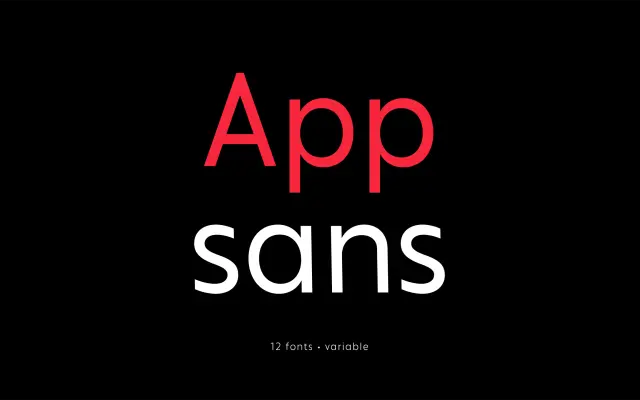
A contemporary sans-serif family in six weights with italics, designed for UI and print use with Cyrillic support and a variable font option.
About
The nearly monolinear letterforms offer reliable legibility at small sizes typical of mobile and web interfaces, while retained stroke contrast gives the family a contemporary character suited to headline use. Twelve styles span ExtraLight through Bold, each with a matching italic, and variable font versions covering the full weight axis are available alongside standard desktop and web licences. Cyrillic support alongside Latin extends its reach to international digital products.
Classification
Nearly monolinear letterforms with some stroke contrast place this in the humanist sans tradition, designed with legibility in mind across UI and print contexts rather than strict geometric or grotesque principles.