Otari
Scribble Tone · 2010
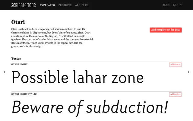
A Wellington-inspired serif released in 2010, balancing expressive display character with enough restraint to hold up at text sizes across five weights.
About
Otari draws on the tension between Wellington's colourful art scene and its conservative colonial British heritage, using that contrast as a design framework. Five weights run from Light to Heavy, each with a matching italic, and the family includes a thorough set of OpenType features: small caps, old-style and lining figures, proportional and tabular variants, discretionary ligatures and arbitrary fractions. Character is most evident at display sizes but does not overwhelm at smaller settings.
Classification
Otari presents as a contemporary serif with display-oriented contrast and character, suitable for both headline and text use. The design balances expressive personality with functional restraint, suggesting a humanist or transitional influence adapted for modern use.