 MegaMegaTypeType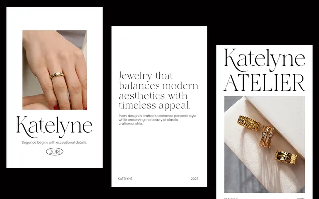
A high-contrast display serif from Say Studio, designed for luxury branding, fashion editorials and premium visual identities, available in Regular and Italic.
About
Galvore pairs graceful proportions with refined stroke contrast, positioning it for use in high-end campaigns and prestige branding work. The family is minimal in scope, offering just two styles, which suits its focused display application. Alternate glyphs and ligatures extend its typographic flexibility within that narrow remit.
Classification
A high-contrast display serif with graceful proportions aimed at luxury and editorial contexts. The strong stroke contrast and refined forms place it firmly in the display serif tradition.
Weights
Regular
Languages
Latin
Tags
displayserifluxuryeditorialfashionhigh-contrastbrandingelegant