Salish
Saja Typeworks · Aaron Bell · 2016
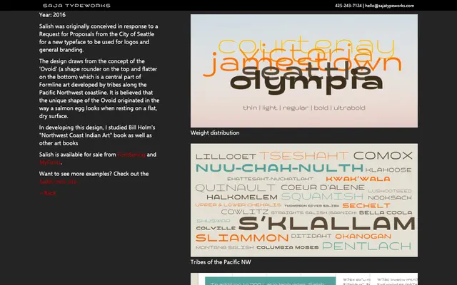
A display typeface drawn from the Ovoid shape at the heart of Pacific Northwest Formline art, originally designed for a City of Seattle branding brief.
About
Aaron Bell developed Salish in response to a City of Seattle Request for Proposals, grounding the letterforms in the Ovoid, a form rounder at the top and flatter at the bottom that recurs throughout Formline art created by tribes along the Pacific Northwest coastline. The Ovoid's origin is traced to the shape of a salmon egg resting on a flat surface. Bell studied Bill Holm's 'Northwest Coast Indian Art' alongside other source material to inform the design.
Classification
Salish is a display typeface with letterforms inspired by the Ovoid shape central to Pacific Northwest Formline art. Its culturally specific geometric influence and intended use for logos and branding place it firmly in the display/decorative category.