Vermouth
Resistenza Type · Giuseppe Salerno · 2020
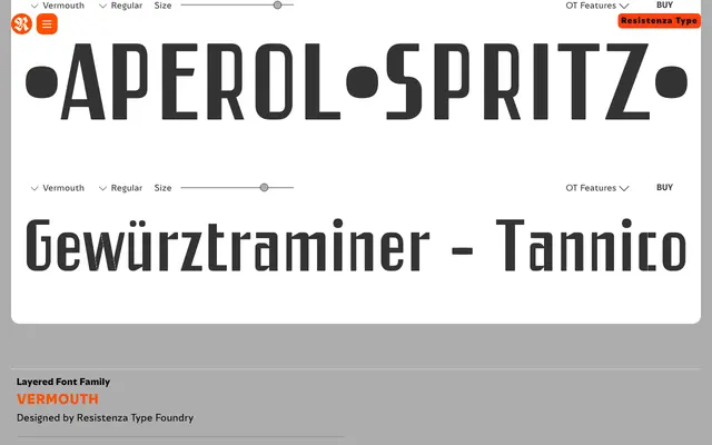
A layered display family of 8 styles built for stacking colour and depth effects, drawn from mid-century Italian sign-painting.
About
Vermouth draws on the bold lettered signage of 1960s Italy, offering eight complementary styles – thick, thin, outlined and "tipsy" bouncing variants – designed to be overlaid for dimensional colour effects. The sans-serif letterforms carry high stroke contrast and a confident vintage energy, suiting headlines, packaging and retro branding work. It ships without italics or width variants and functions strictly as a display tool.
Classification
Sans-serif letterforms engineered as a layered display system; high stroke contrast between thick and thin variants; inspired by mid-century Italian hand-painted signage. Not intended for text setting.