Tresor
Resistenza Type · Giuseppe Salerno and Paco González · 2020
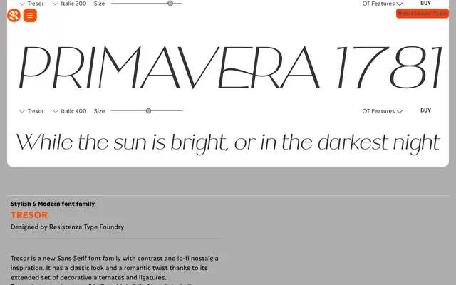
A high-contrast display sans-serif with a romantic edge, offering three weights with italics and over 1,000 glyphs of decorative swashes, alternates and ligatures via OpenType.
About
Tresor — French for "treasure" — is a display sans-serif by Giuseppe Salerno and Paco González, built on controlled contrast and what the foundry calls lo-fi nostalgia. The family spans three weights (100 through 400), each with a matching italic, and ships with an extensive set of ornamental alternates, swashes and ligatures accessible through OpenType features. It suits headline work, brand identities, packaging and stationery rather than body copy, and the weight range is too light for most text applications.
Classification
High-contrast display sans-serif with a romantic, nostalgic character. Built around contrast rather than strict geometric or humanist principles. Very light weight range (100–400 only); the ornamental emphasis — extensive swashes, alternates, ligatures — places it firmly in display territory despite the sans-serif skeleton.