Superpop
Resistenza Type · Giuseppe Salerno and Paco González · 2023
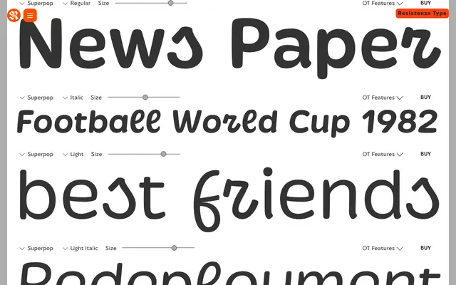
A rounded geometric display sans with brushy, script-influenced letterforms, offered in five weights with matching italics and an outline variant, plus a variable font.
About
Superpop blends geometric construction with calligraphic instincts – each letterform carries a softness that sits somewhere between a conventional sans and a script face. Designed by Giuseppe Salerno and Paco González at Resistenza, it comes in five weights plus an outline cut, each with a matching italic, alongside a variable font for smooth weight interpolation. Its sweet, fizzy character suits food and drink branding, children's publishing and social media content where warmth and energy matter.
Classification
Rounded geometric sans-serif with brushy, script-influenced letterforms. The geometric structure is softened by calligraphic instincts in the stroke details, placing it between a conventional sans and a script face. Designed strictly for display use – not suitable for body text or editorial work.