Red Oak
Resistenza Type · Giuseppe Salerno, Paco González
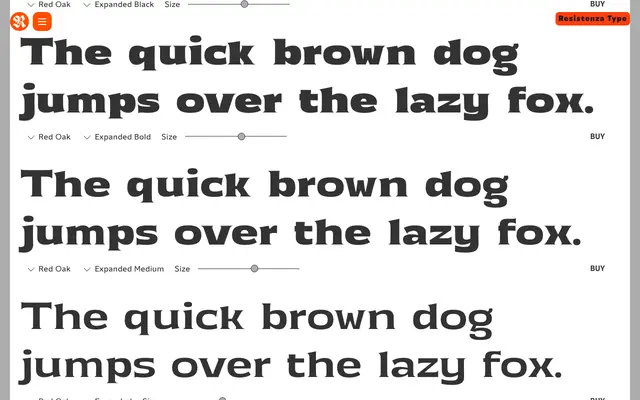
A 24-style wedge-serif family from Resistenza spanning four widths and six weights, with narrow tapered serifs that give it a faintly vintage, engraved character suited to editorial and branding work.
About
Red Oak is a wedge-serif with narrow, elegantly tapered serifs that sit somewhere between classical Latin letterforms and contemporary display type. Its four width variants – Condensed, Regular, Wide and Expanded – each run across six weights from Thin to Black, giving designers genuine range across both setting size and spatial needs. There are no italic cuts, so it works best in contexts where weight and width alone carry the typographic hierarchy.
Classification
Wedge (or Latin) serif with narrow, tapered serifs characteristic of the style. Upright-only family spanning four widths and six weights, giving it a broad range from compressed headlines to wider text settings. The contrast is moderate, balancing legibility with a faintly vintage, engraved quality.