Pressato
Resistenza Type · Giuseppe Salerno and Paco González · 2024
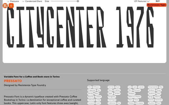
A variable reverse-contrast display family, commissioned by a Turin coffee bookshop, with three axes covering weight, width and slant across 12 static cuts.
About
Pressato is an uppercase-only display family from Resistenza Type, designed in collaboration with Pressato Coffee Bookshop in Turin. It applies reverse-contrast logic with sharp corners and rectangular counters, drawing on early sci-fi and tech aesthetics. Three variable axes – weight, width and slant – yield 12 static fonts plus a variable version, making it a usable choice for distinctive branding and editorial headlines.
Classification
Uppercase-only reverse-contrast display sans. Thick where conventional type is thin, thin where it is thick. Sharp corners, rectangular counters and a geometry that references early tech and sci-fi typography. Three variable axes: weight, width and slant. The slant axis produces deliberately skewed, angular effects rather than a conventional italic.