Ordine
Resistenza Type · Giuseppe Salerno and Paco González
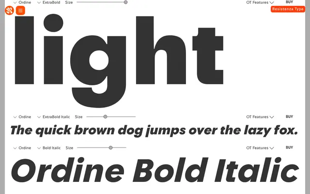
A geometric sans-serif variable font with perfectly circular counters, nine weights with true italics, and broad multilingual coverage across 200-plus languages.
About
Ordine is built around circular counters in its key letterforms, giving it a clean geometric foundation softened by a two-story g and a subtly modified e that improve on-screen legibility. The family spans Thin to Black as a variable font with a full set of true italics, making it flexible across editorial and branding contexts. Lighter weights suit running text and editorial work; heavier cuts lean toward sportswear, packaging and identity design.
Classification
Modern geometric sans-serif built around perfectly circular counters in letters like o, e and a. Avoids the sterility typical of strict geometric designs through a two-story g and a softened horizontal bar on the e for legibility. Distributed as a variable font spanning Thin to Black with true italics at each weight. Oblique variants also available alongside the italics per the foundry page.